UI/UX Design
Interfaces designed around the people who use them.
Good design is not decoration. It is the difference between a product people struggle with and one they come back to. I design web and mobile interfaces from research and user flows through wireframes, prototypes, and final UI, so every screen has a clear job and every click has a reason.
What I do
UX Research & User Flows
Before any screen gets designed, I map out who the users are, what they need to accomplish, and where current experiences break down. Deliverables include user journeys, task flows, and information architecture.
Wireframing & Prototyping
I sketch low-fidelity wireframes to settle structure and navigation early, then build clickable Figma prototypes so you can test the experience with real users before a single line of code is written.
UI Design & Design Systems
High-fidelity interface design with consistent typography, colour, spacing, and components. For larger products I build reusable component libraries so the design scales without falling apart.
Usability & Conversion Review
Already have a product? I audit existing interfaces for friction points, accessibility issues, and drop-off causes, then redesign the screens that are costing you users and revenue.
UI/UX Case Studies
Selected product design work across mobile apps, SaaS platforms, and consumer websites.
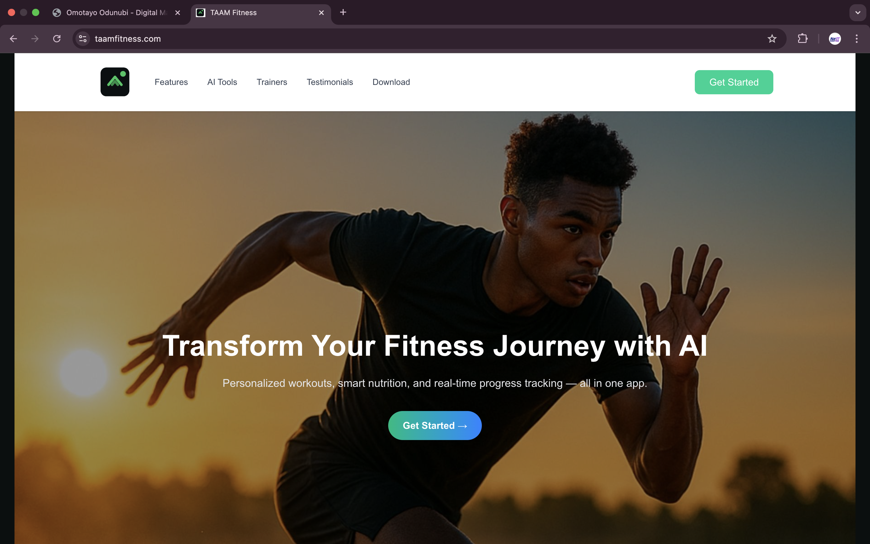
TAAM Fitness: AI Fitness Trainer & Gym Finder
UX/UI Designer
Tools: Figma, User Flows, Interactive Prototyping
A fitness platform pairing AI-guided personal training with map-based gym discovery. The core UX challenge was combining two very different tasks, following a workout plan and finding a nearby gym, into one coherent experience.
Design Work:
- ✓ Mapped user flows for onboarding, workout sessions, and gym search
- ✓ Designed the map-based Gym Finder with filters and distance-first results
- ✓ Created workout screens that stay readable mid-exercise, with large targets and minimal text
- ✓ Prototyped and refined the onboarding to reduce steps before first value
Outcome
A validated product concept with a clickable prototype used to pitch the MVP to early testers and investors.
11:1 Bible App: A Quiet Space for Scripture
Product Designer & Developer
Tools: Figma, Next.js, Tailwind CSS, iOS
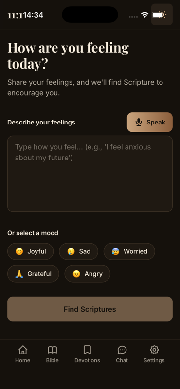
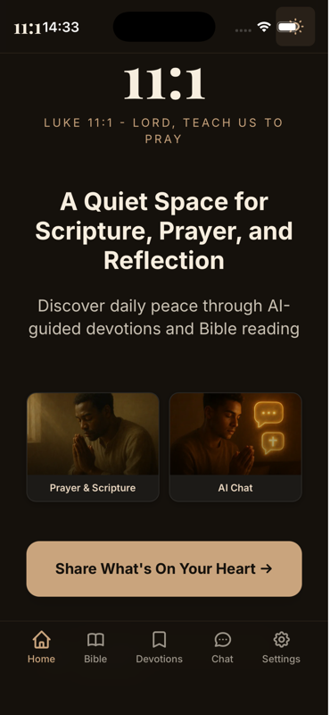
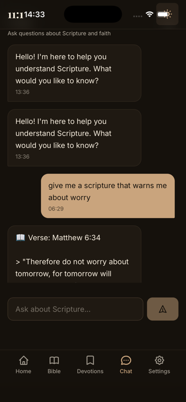
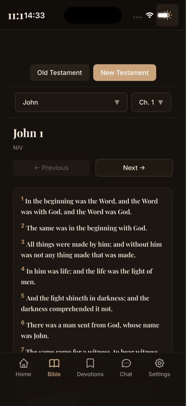
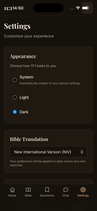
A minimalist Bible app built around calm, distraction-free reading. Most Bible apps compete on features; this one competes on restraint. The design brief was to remove everything that gets between the reader and the text.
Design Work:
- ✓ Designed a typography-first reading experience with generous spacing and no visual clutter
- ✓ Built feeling-based search so users can find verses by how they feel, not just by reference
- ✓ Designed dark mode as a first-class experience, not an afterthought
- ✓ Kept navigation to a minimum: daily verse, search, prayer points, and chat
Outcome
A shipped iOS app where the design goal, calm over clutter, carries through every screen.

Legal AI.d: Legal Assistant for Nigerians
UX Designer & UX Writer
Tools: Figma, React Native, Conversation Design
An AI legal and tax assistant for people with no legal background. The UX problem: legal information is intimidating, and most users abandon tools that feel like they were built for lawyers. The interface had to feel like asking a knowledgeable friend.
Design Work:
- ✓ Designed a chat-first interface supporting both English and Pidgin
- ✓ Wrote plain-language microcopy that translates legal jargon into everyday terms
- ✓ Designed the tax calculator flow to ask one question at a time instead of presenting a long form
- ✓ Structured document generation as a guided step-by-step journey
Outcome
An approachable legal tool that ordinary users can navigate without help, validated through an early-access waitlist.
Pendo: Product Analytics & Digital Adoption Platform
SaaS UX Strategist
Tools: Figma, Information Architecture, Conversion Optimisation
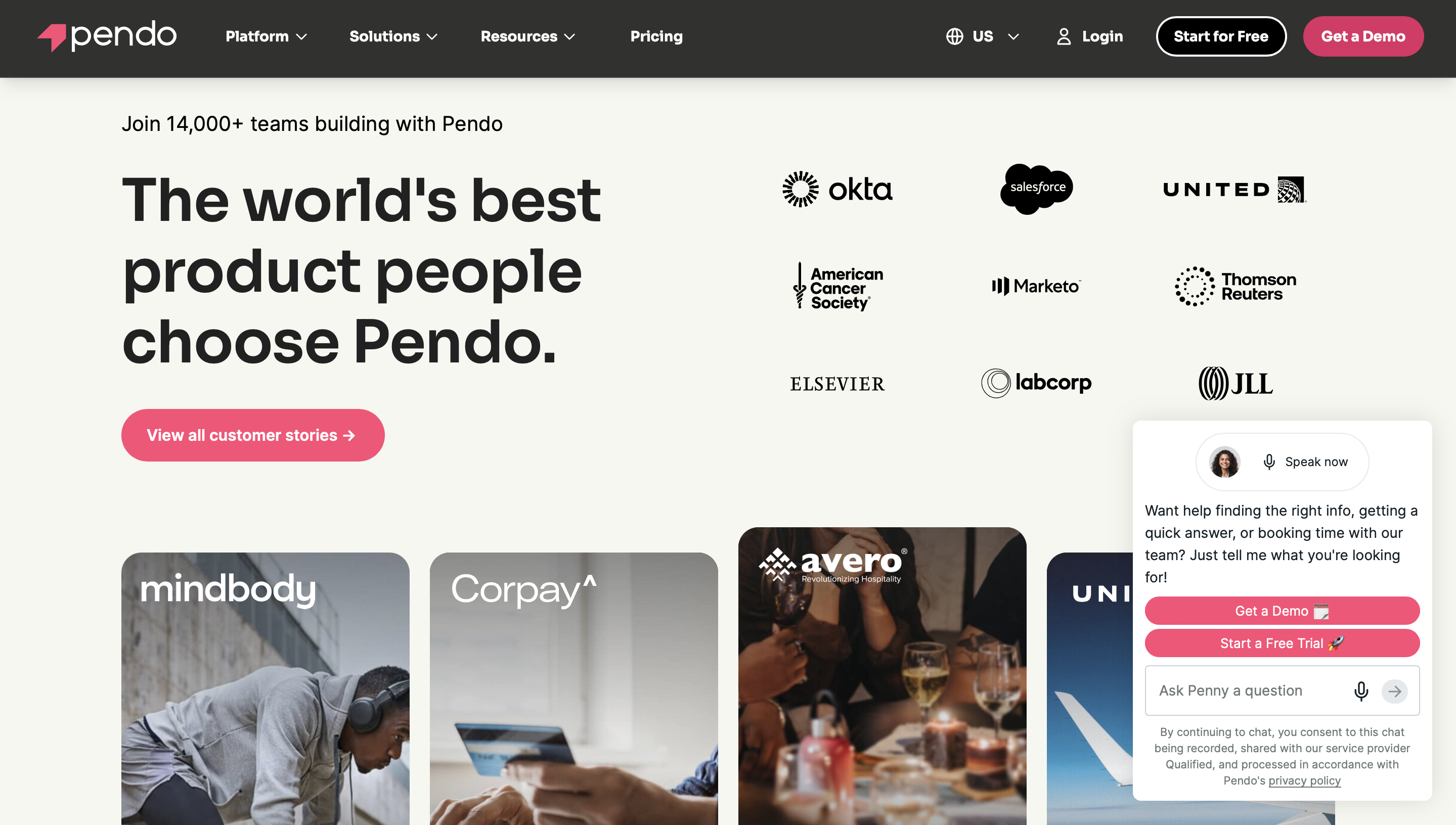
Pendo sells complex analytics software to enterprise buyers. The UX challenge was making a dense, technical product understandable within seconds of landing on a page, for both technical evaluators and executive decision-makers.
Design Work:
- ✓ Restructured feature pages so each one answers "what does this do for me" before showing specifications
- ✓ Designed demo request and trial flows with the fewest possible fields
- ✓ Built industry-specific landing page templates so each audience sees relevant use cases
- ✓ Reworked pricing and comparison layouts to reduce decision friction
Outcome
Improved trial sign-up rates and clearer product communication for enterprise and mid-market audiences.
Abadeen: Australian Luxury Property Developer
UX/UI Designer & Brand Experience Architect
Tools: Figma, HTML/CSS, Visual Storytelling
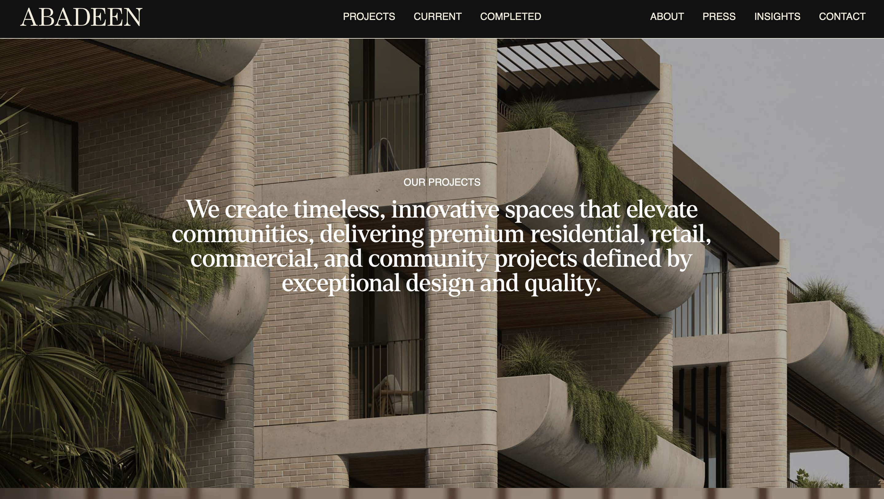
A high-end property developer whose buyers make decisions worth millions. The experience had to communicate architectural quality through the interface itself: if the website feels cheap, so does the development.
Design Work:
- ✓ Designed an editorial-style layout with full-bleed photography and restrained typography
- ✓ Created development showcase pages that walk buyers through location, design, and lifestyle in sequence
- ✓ Designed the project pipeline section for off-plan buyers researching future releases
- ✓ Kept interactions understated so the properties, not the interface, hold attention
Outcome
A digital experience that matches the standard of the developments and supports high-value buyer inquiries.
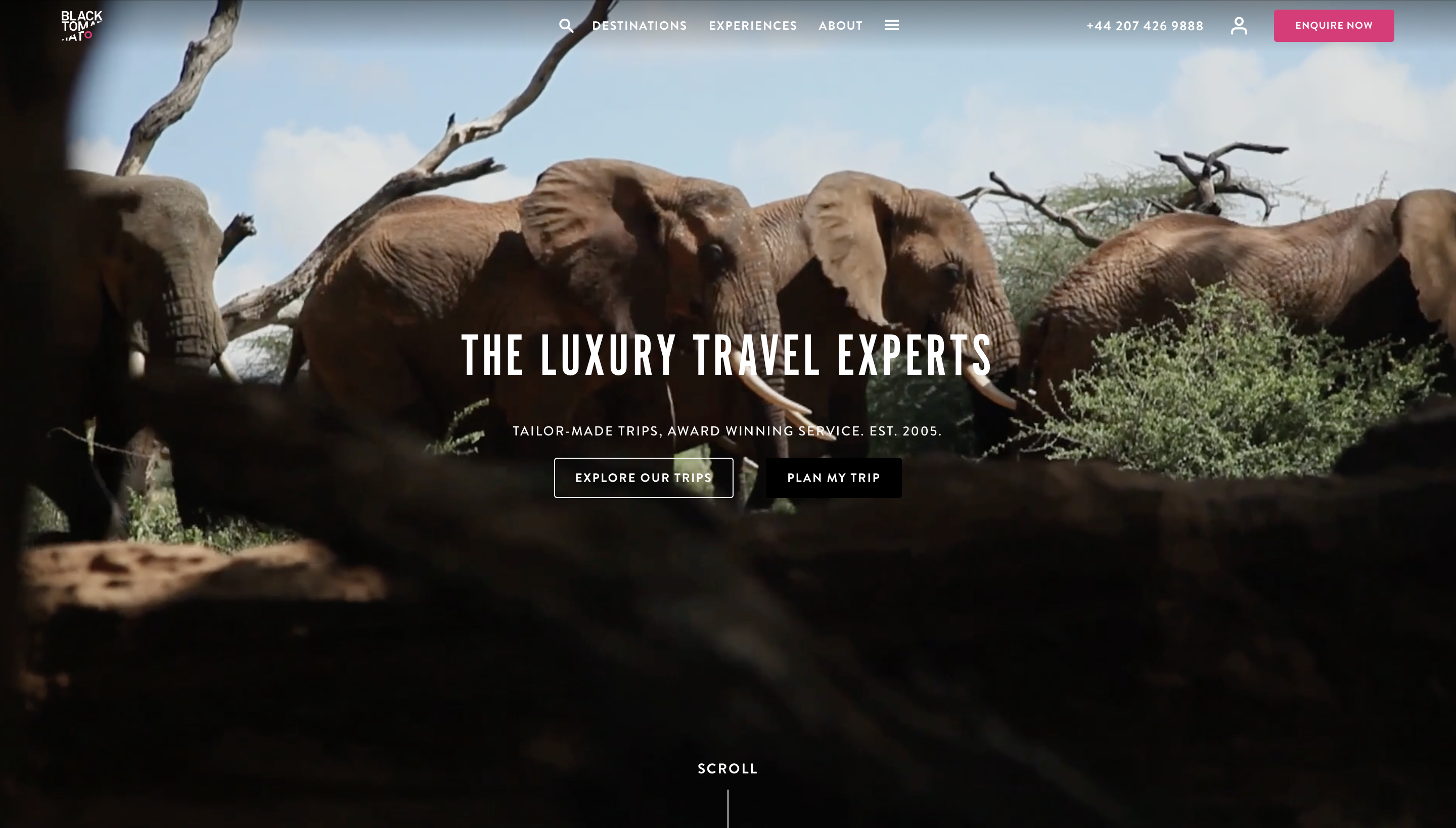
Black Tomato: Bespoke Luxury Travel
UX Designer, Experience & Conversion Design
Tools: Figma, Content Hierarchy, Inquiry Flow Design
Black Tomato designs personalised luxury trips, and its buyers expect the booking experience to feel as considered as the travel itself. The UX brief was to make a bespoke inquiry feel personal rather than transactional.
Design Work:
- ✓ Designed destination pages that lead with imagery and let details unfold as users scroll
- ✓ Rebuilt the trip inquiry flow as a short conversation instead of a booking form
- ✓ Structured content hierarchy to guide users toward a consultation without pushy CTAs
- ✓ Designed for the browsing mindset: users planning trips return many times before committing
Outcome
A considered, editorial experience that drives high-value consultation bookings.
How I approach design
Research
I start by understanding your users, your business goals, and your competitors. Design decisions made without this context are just guesses.
Define
I map user journeys and information architecture, deciding what each screen needs to do and in what order users will encounter them.
Wireframe
Low-fidelity layouts settle structure and navigation early, when changes are cheap. We agree on the skeleton before styling anything.
Prototype
I build clickable Figma prototypes so you and your users can walk through the real experience and catch problems before development.
Deliver
Final UI with organised files, reusable components, and developer handoff notes, or I build it myself as a working product.
Tools I work with
Have a product that needs better design?
Whether you're starting from a blank page or fixing an interface that isn't converting, let's talk about what your users actually need.
Start a design project